Recently, the phrase “ergonomic site design” was absolutely unclear. After all, we are used to the concept of “ergonomics” referring to furniture or real design. However, recently it has become obvious that the creation of a website is not only programming and SEO optimization but also the convenience of data perception, taking into account the physical and psychological characteristics of humans.
First of all, the structure of the site should be clear and easy to use. The colors must be pleasing to the eye. Read below about these and other aspects of ergonomic sites.
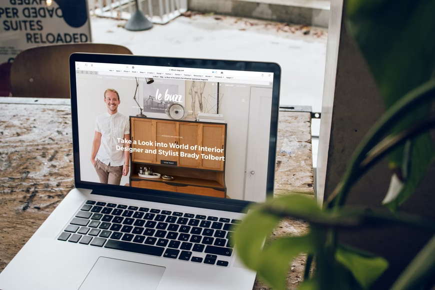
What is an Ergonomic Website?
The user interface (UI) is a part of the program that is in front of the user and is designed to provide data display, control, or interaction with the customer. During the development, special attention should be paid to the design of the program.
Professional UI/UX design services will include thinking in detail about the arrangement of controls, the way data is displayed, etc. Even if the program works correctly, the user may experience dissatisfaction with the product due to seemingly insignificant things. This feeling can eventually lead to an increased bounce rate.
If we talk about the most general principles for designing user interfaces, then we can name three main provisions:
- The program should help to complete the task and not become this task. The first principle is the transparency of the interface. The interface should be easy to learn and not create a barrier for the user to overcome to get started.
- When working with the program, the user should not feel like a fool. The second principle is often violated by software developers who overestimate the skills of users. Or on the contrary, users are seen as a kind of stupid crowd, unable to understand the most elementary functions
- The program must work in such a way that the user does not consider the computer a fool. Despite the rapid development of information technology, many computer programs still have primitive AI. They interrupt the user’s work with stupid questions and display meaningless messages on the screen, causing disappointment in the most simple situations.
Now we know exactly what the website shouldn’t look like. Let’s focus on the reverse side and consider the best practices for making ergonomic websites.
Steps to Hiring a SaaS Development
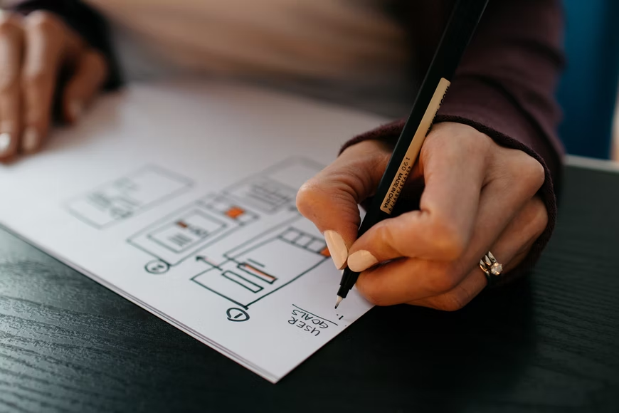
Golden Rules of Interface Development
It seems that building an ergonomic interface is a complex task. Indeed, developers should keep in mind all the trends and integrate the best practices in their work. In particular, we are talking about the following principles for building interfaces:
- Golden Section
The golden section is the most comfortable proportion for the eye, which is based on a combination of symmetry and the golden section. It contributes to the best visual perception and inspires a sense of beauty and harmony.
- Miller’s Wallet
When applying the principle of Miller’s wallet in interface design, you should group the elements in the program (toolbar buttons, menu items, tabs, etc.) taking into account the following rule – no more than seven in a group.
- The Principle of Grouping
According to this rule, the program screen should be divided into clearly defined blocks of elements. At the same time, the grouping, of course, must be meaningful: both the arrangement of elements in groups and the arrangement of the groups themselves must be thought out.
- KISS
This philosophical principle says: “Do not multiply entities without a specific need.” As the Americans say – Keep It Simple, Stupid. Going back to the UI principles, this means:
- any task should be solved with a minimum number of actions;
- the logic of these actions should be obvious to the user;
- cursor movements and even the user’s eyes must be optimized.
- Visibility Reflects Usefulness
The meaning of this principle is to bring the most important information and controls to the forefront and make them easily accessible to the user and move the less important information to the menu.
- Smart Borrowing
Borrowing widely used interface design techniques can dramatically reduce learning time and increase user comfort. They will use the already acquired skills – this issue also affects the principle of equality between the system and the real world.
When creating a design for a future site, there is no need to limit developers. The most daring ideas aimed at increasing external attractiveness must be implemented. And it doesn’t matter for what purpose Internet pages are created, a visitor must certainly experience positive emotions, stay on the site, and get to know it better.